Diamond Braces
At 27yrs old I decided to get braces in 2018. Not the invisalign or ceramic braces, the metal braces. I thought why not? I've always wanted to get them in high school then I can finally put this strange insecurity behind me. To feel even better about my decision I resemble Sid from Toy Story and have many excuses as to why I'm acting out from time to time like an angsty teenager. After exploring my options from various orthodontic clinics, I chose Diamond Braces.
It's a nice office based in Jersey City. It's affordable, clean, the service is professional and timely, and most of the clients they serve are people of color. Not only are their clients POC, the staff is very diverse and super friendly.
The Problem
Despite it's professional in-person service, they seem to have not fully carried their good manners over to the design of the mobile app. As a designer, I was quite shocked at the aesthetics of the UI and the minor UX flaws. The style is quite outdated and seems to have never left the Jellybean OS days of Android.
The Critique
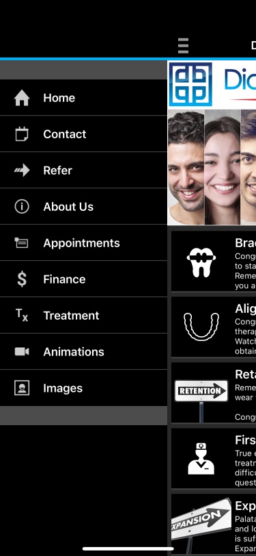


The first thing that came to mind was the UI design. The color scheme and the typography system is not consistent with the current brand identity a user would see in person when he or she visits the office. At first glance after you've signed in to the app, as you would see on the second screen, I was hit with information overload.
My initial reactions were:
- What is this content and why is the being shown to me?
- Where are my progress photos?
It appears that the goal of this app is to inform its clients of proper dental care since it's the first thing a user sees after signing up. Which is very nice of them, but I'm not using invisalign or expanders. So it just feels there is so much content I can live without. Dental care is VERY important but naturally if I feel there's more I can do to clean my mouth I'll dig for that information when it's time.
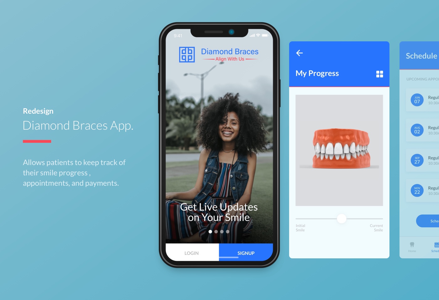
The Solution
I inspected the website and gathered the information I needed to create a brand system for the app.
![]()
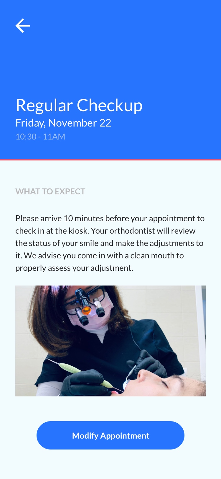
My approach to the design is to essentially make things lighter and space the content out for readability. Another goal of mine is to organize the content structure for this app. Lastly, take on an approach catering to clients who open the app to view the progress their smile and displaying dental care information based on what type of treatment they're using. For example, since I'm using braces I just need to see my progress in photos and dental care information about braces.


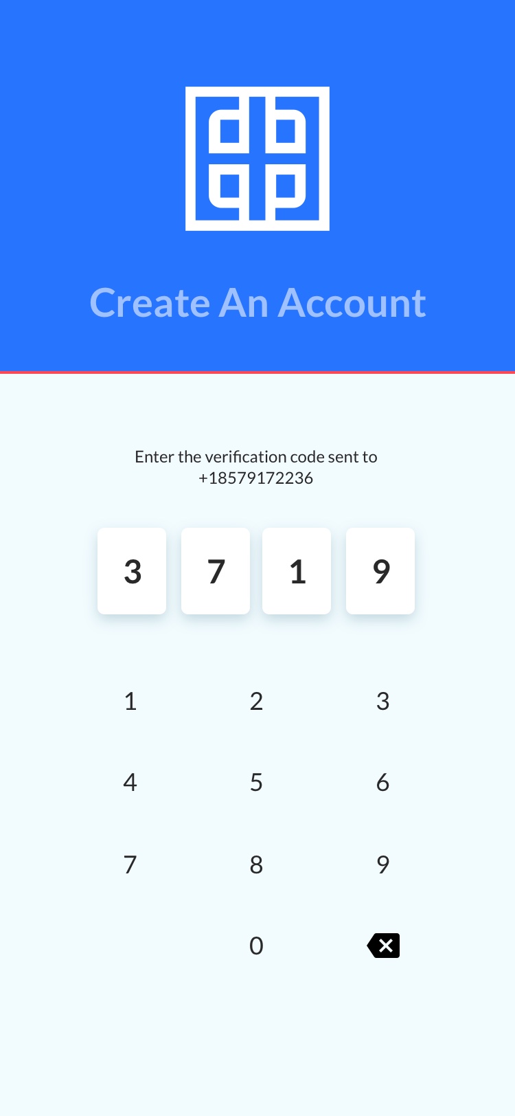


Here's the user flow demonstrating how a user would sign up for the first time. Diamond Braces initiates by sending you a verification code to your phone to confirm if you are in their system as a registered patient.
Also here's a link to the working prototype built in React.
Final Thoughts
There seems to be a common trend where health related apps for clinics aren't treated with much respect in the visual and structural department. I would love to discover why that is. And oh don't get me started on the interfaces I see in the offices. The aesthetics have never left Windows XP days, but it's probably for good reasons since they're managing millions of personal data and I can't imagine the overhaul it'll take to just freshen things up or make the experience more enjoyable for their employees.
A few questions I asked myself:
- Is it because clinics need a digital product to promote its inital opening to the community?
- Why don't these clinics have dedicated digital production services to maintain and update their apps?
- Is it costly to maintain?
- What's the communication like between the stakeholders and the agency they hired to produce this work?